Data Visualization: The Art of Translating Information into Story
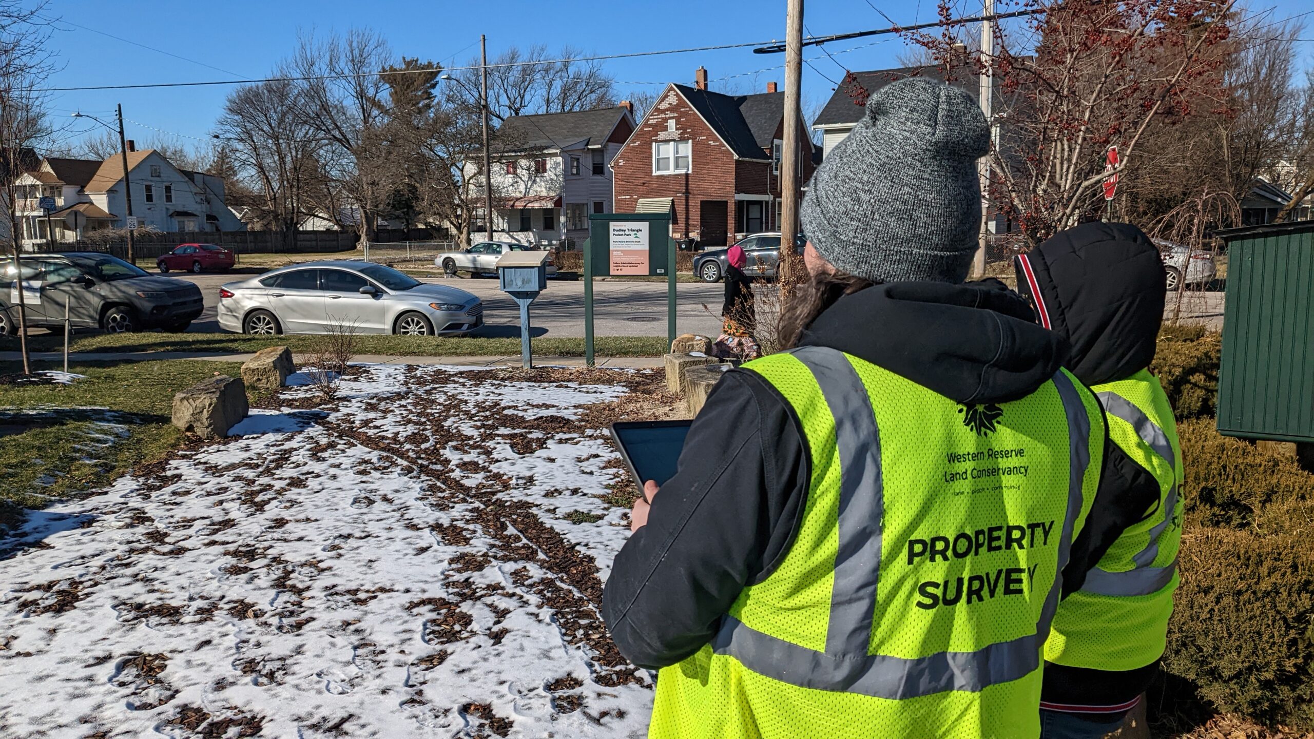
After months of collecting information on thousands of data points focused on housing, landscape, and civil infrastructure, one of the proudest moments for our Property Inventory team is the opportunity to present the results of our completed survey, when every single parcel within our specific geography has been evaluated, to our partner community. This is a crucial moment where we transition our team from collecting and assessing the quality of the data collected to creating a strategy to best tell the story of the immense amount of data collected.
This process, called data visualization, uses visual elements to represent large data sets so that the results are accessible to residents, stakeholders, and policy makers in city government. Our data visualization toolkit includes charts, graphs, and maps that tell the story of the data. These elements are then woven into a template called a Story Map. This Story Map tells the narrative of each completed Property Inventory and is linked as a webpage that can be accessible to anyone interested in the results of each project.
The Manager of GIS at Western Reserve land Conservancy, Sadie Jones, produces each story map using ESRI ArcGIS StoryMaps, a story authoring web-based application that allows us to share our maps in the context of the Property Inventory narrative, specific to each community we work with. This application can include maps, narrative text, lists, images, videos, embedded items, and other media. A powerful example of the importance of our Story map came during our 2023 Cleveland Property Survey. Using survey questions focused on lead abatement, our team noticed spatial relationships between homes with high indications of lead paint in proximity to a school within a specific Cleveland Neighborhood. The map below shows how the story map represented this finding:
Goals we aim to achieve when developing our Story Map include clarity of the information, accessibility, and readability. Tim Dehm, our Planning and Design Specialist, uses his design expertise to create dynamic and accessible charts, helping the audience understand the information quickly and clearly. Tim synthesizes the data collected and shares the findings in a visually simplistic way, choosing charts that showcase the key points in the clearest and most common visual format. A precise understanding of what we have measured is vital. Using clear chart titles, descriptive observations, and overlaying visual annotations onto charts leads to quicker processing of the point of the data visualization. Below is an example of our team’s use of charts to convey data collected:
Almost everything can be counted and measured. We are only in the formative phase of learning how data will change our lives, and it needs the help of a communicator. We rely on data to tell us what has happened, and stories to tell us what it means. By framing this data through stories, we enable decisions to be made faster and inspire others to act. Effectively and efficiently delivering the data collected to our partner communities is crucial, as decisions made using our property inventory data are used to support the policies that determine a community’s future.
For more information about our Property Inventory program, and to view past Property Inventory Story maps please visit our Property Inventories webpage:
To continue exploring the field of data visualization, please visit ESRI’s Introduction to ArcGIS StoryMaps:
https://doc.arcgis.com/en/arcgis-storymaps/get-started/what-is-arcgis-storymaps.htm
